How the mind makes sense of the screen.
When we interact with any digital interface, our brains do far more than we consciously realize. UX operates at the junction of
- sight
- cognition
- emotion
— each click, color, decision, or transition taps into deep-seated perceptual processes. But behind these details is a complex psychological framework that influences how people perceive, interpret, and react to digital environments.
The mind makes sense of the screen by actively organizing, filtering, and interpreting visual information, drawing on past experiences, expectations, and emotional responses.
To understand the depth at which UX must operate, designers must go beyond layout, the latest design software, and pixel aesthetics to explore how the mind makes sense of the screen. This exploration into the psychology of perception reveals why certain designs resonate with their audience while others miss the mark.
Perception as a Filter
How people "see" digital experiences
Perception in psychology is an interpretive process. It is the active, interpretive process of making sense of digital interfaces. It's how their minds process, organize and emotionally respond to visual cues and structures. This psychological process shapes how they navigate, understand, and feel about the design, influencing everything from ease of use to emotional resonance.
When a person encounters an interface, they're not passively absorbing information. Instead, they're actively filtering, organizing, and interpreting what they see, influenced by past experiences, expectations, and even innate cognitive tendencies. This means that every design choice (visual hierarchy, spacing, color contrast, etc.) affects how they understand what they see.
Take, for example, a simple landing page.

A clean layout and hierarchy can guide people directly to where you want them to go but they may get lost or overwhelmed if the page is cluttered or lacks a clear visual structure. This now becomes a psychological issue. Our minds prioritize certain elements over others based on factors like size, fonts, color, wording, and positioning, following a set of perceptual "rules" that designers can harness to lead people naturally through a flow.
Our perception is influenced by context which can vary greatly depending on external factors such as lighting, screen size, and device type. Interpretations of a smartphone design might differ from perceptions of a desktop design. UX designers can enhance perception by tailoring layouts and visuals to adapt to different contexts so that key information remains accessible and prominent across devices.
People often enter a digital space with specific goals in mind, leading them to focus selectively on elements related to their objectives. Understanding selective attention means designing with the person's mental "filter" in mind, foregrounding the most relevant information while minimizing distractions. Bold your key points or use distinct iconography for action items to draw attention precisely where needed.
Finally, not all aspects of perception are conscious. Subtle design choices such as the rhythm in text spacing or alignment with cultural reading patterns impact how people subconsciously organize and interpret information. Designers can use these techniques to align with cognitive tendencies to align the person's unconscious processing with the intended flow of the experience.
Gestalt Principles
The foundation of perceptual organization
One of the most influential frameworks in the psychology of perception comes from Gestalt psychology, a theory that explains how people tend to organize visual elements into groups or unified wholes. These principles, developed by psychologists in the early 20th century, reveal that our minds seek patterns, structure, and coherence in visual stimuli. For UX practitioners, understanding Gestalt principles — like similarity, proximity, and closure — provides a toolkit for crafting intuitive interfaces that align with how the brain naturally organizes information.
Let's look at a few commonly known ones.
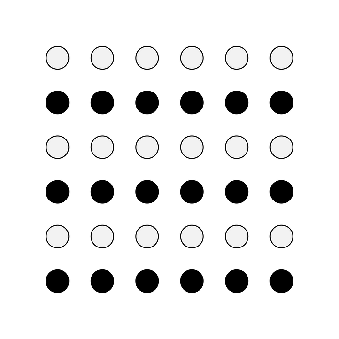
Similarity: Creating cohesion through visual patterns
The principle of similarity suggests that our brains group similar appearing elements, seeing them as part of a larger pattern. In UX, this translates to creating cohesive design elements, like using consistent colors or shapes for buttons. When people see similar-looking elements they intuitively recognize that these items share a function or meaning. This simplifies navigation and reduces cognitive strain on them.

Consider, for example, how e-commerce sites often use color-coded "Add to Cart" buttons across product listings. The repetition of color and shape helps customers quickly recognize where to click, minimizing their mental effort. By aligning with the brain's preference for grouping similar elements, designers can make interactions feel effortless, creating a smooth experience that allows people to focus on content rather than searching for actions to perform.
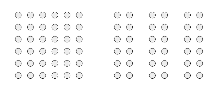
Proximity: The power of spacing in guiding attention
Proximity is another core Gestalt principle that plays a significant role in UX. It states that items close to each other are perceived as related. When elements are grouped together on a screen, people interpret them as part of the same category or function. This simple spacing tactic can guide peoples' attention and provide a clear sense of structure, even on a busy, complex page or interface.

For instance, imagine a form layout on a checkout page. When labels, input fields, and buttons are arranged closely together, people instinctively understand they belong to the same action sequence. Unnecessary space between elements can confuse people, leading them to second-guess the order or intent of actions. By thoughtfully grouping items, designers make it easier for people to complete tasks without hesitation.
Let's look at one more.
Closure: Helping humans "complete the picture"
Closure refers to the brain's tendency to fill in gaps to create a complete, recognizable object. In UX, this principle is powerful when used subtly, helping people understand interfaces without overloading them with details. Effective use of closure can make interfaces feel intuitive, as they unconsciously "fill in" the structure based on partial information.

Take, for instance, a progress bar that isn't fully filled. The person immediately understands that they haven't completed the task and will intuitively aim to reach the endpoint. Or consider icons that imply a function without explicit labels — like an envelope representing email or a magnifying glass for search. By allowing people to mentally "complete" these elements, designers save space while providing clear, universal cues that feel intuitive across contexts.
Perceptual Expectations
The influence of familiar patterns
Our brains are wired to seek familiarity and this applies strongly in digital environments. When people encounter patterns that feel known (a standard menu icon or a familiar layout) they can navigate confidently and easily. This isn't just because people are accustomed to certain designs. It's because familiarity aligns with their mental models, the internal frameworks they use to make sense of the world.
Mental models allow people to anticipate interactions, reducing cognitive load and enhancing their experience. Respecting these models means creating designs that build on existing knowledge without requiring excessive interpretation. A simple example is placing a shopping cart icon in the upper right corner of an e-commerce site. This placement aligns with their expectations and makes it instantly recognizable without requiring an explanation.
Breaking these perceptual expectations can lead to confusion, hesitation, and frustration. People may get disoriented if a website's navigation is non-standard or key elements are hard to find. They're now grappling with the disruption of their mental model. Good UX respects these cognitive shortcuts, creating interfaces that feel comfortable and logical, almost as if they're an extension of peoples' prior experiences.
Priming and expectancy
A person's past interactions with digital spaces prime their expectations, influencing how they interpret new experiences. Someone familiar with social media platforms has mental models that affect how they perceive interactive elements (e.g., swipe gestures, like buttons). Designers can leverage priming by incorporating familiar patterns or adjusting layouts to align with these anticipations, creating a sense of continuity.
Anticipated feedback
People expect feedback from their actions — whether visual, auditory, or haptic feedback. When they press a button, they anticipate an immediate response (e.g., a color change or loading indicator). This feedback loop confirms action and reduces uncertainty. Designers who prioritize feedback mechanisms align with user expectations, creating experiences that feel responsive and "alive."
Emotional Perception

Design triggers feeling and response
Perception isn't purely intellectual. There's a deeply emotional side as well. Colors, shapes, words, decisions, and movements all evoke feelings, and these responses affect how people perceive a brand or interface. Color psychology, for instance, shows that blue can evoke trust in some cultures, while red can create urgency. When people encounter these colors in a specific context, it influences their mood and, ultimately, their behavior.
Animation is another powerful tool. Subtle, micro-transitions, like a gentle fade-in or a quick bounce, can inject personality and emotional tone into an interaction. A loading animation, for example, can calm or frustrate people, depending on its length, design, and smoothness. By understanding how visual cues impact emotions, designers can create experiences that resonate on a personal level.
People are more likely to stay engaged when they feel in control of the experience. Perceptive UX empowers people by offering clear pathways, undo options, and visible progress indicators (to name just a few), which collectively reduce anxiety and instill confidence. Ensuring your customers feel autonomous and capable throughout the interaction can transform an experience from merely functional to genuinely rewarding.
Designing through the lens of perception
The mind does more than process a visual presentation of pixels. Through perception, it constructs deep meaning and connects them with the experience. Perception is an active process shaped by cognition, emotion, and prior experience.
When the UX discipline understands the psychology of perception, they can create interfaces that feel deeply intuitive, intentional, and purposeful. Through principles like Gestalt grouping, mental models, and emotional cues, UX becomes a practice that respects the natural ways people interpret and navigate the world.
By grounding designs in these psychological principles, we set the precedent for digital spaces that meet people where they are — honoring their innate ways of seeing, understanding, and connecting. We transform UX from a technical endeavor into a truly human-centered experience.

.png)